
- /SEO
- /On-Page SEO
Etereo Stays
Search visibility for a new Goa stay site in 90 days
- Organic click growth
- 194%
UX/UI Design
Pixoflix turns complex journeys into clear digital experiences by balancing user behaviour, business priorities and technical reality.
What design is for
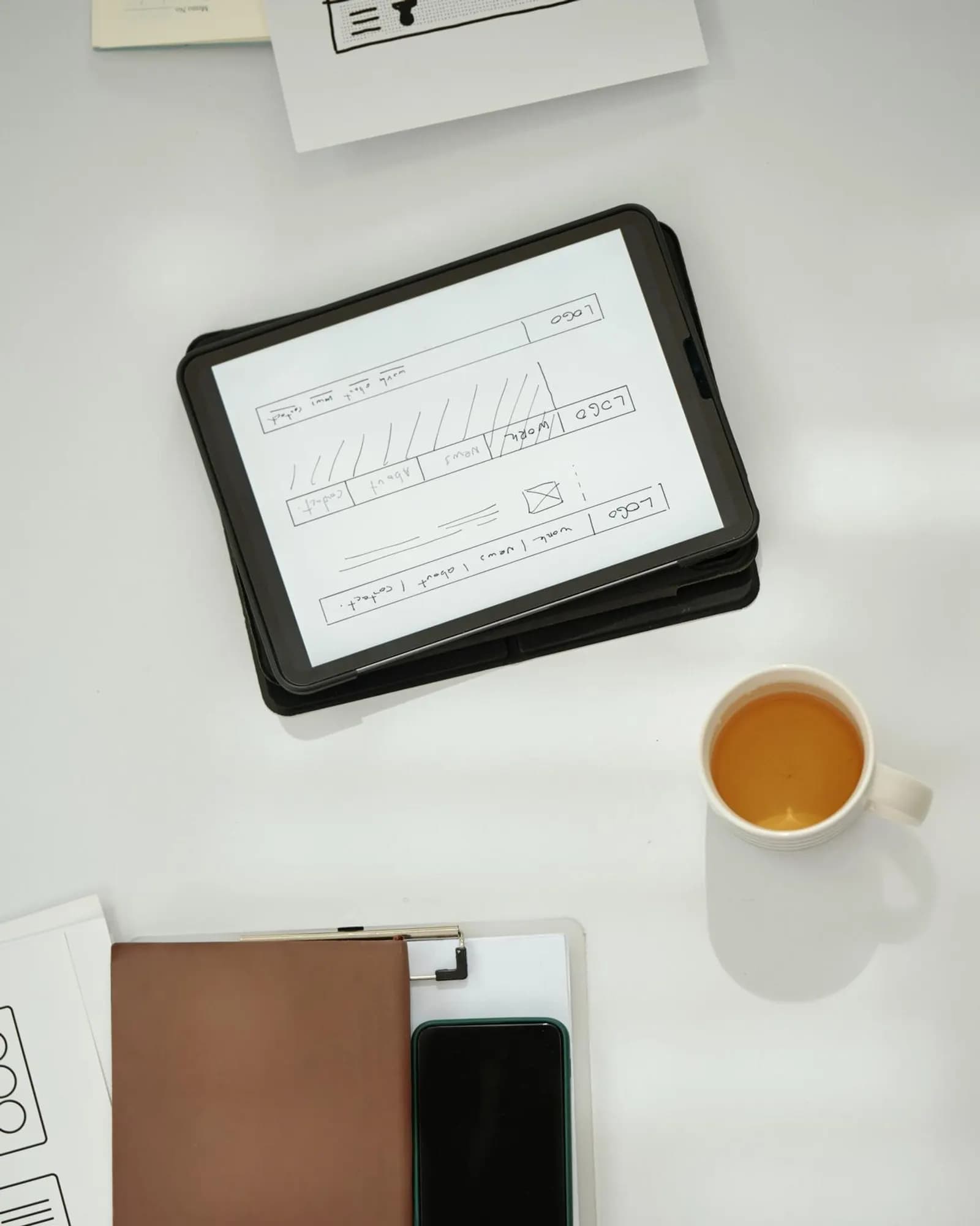
UX work here starts with the job the user is trying to finish and the constraint the business cannot ignore. Structure, interaction and visual design are treated as one set of decisions, then validated before engineering spends a quarter interpreting Figma literally.
The design range
The entry point changes with the problem. The method does not: understand, structure, design, test, hand off.
Marketing websites for companies that need authority, a clear offer and a path to the next conversation.
Interface systems for products people use weekly, where consistency matters more than a single hero screen.
Mobile product design with a disciplined focus on flow, hierarchy and the limits of a small screen.
SaaS UX that makes onboarding, activation and the weekly habit easier to defend in a review.
Dense information interfaces that stay readable when the data is incomplete, late or contradictory.
Campaign pages designed around one offer, one audience and one decision, ready for paid and organic traffic.
A diagnostic of friction, drop-off and decision points on a live experience, with a sequenced fix list.
Evidence gathering that replaces assumption with observed behaviour before more screens are drawn.
Shared components, tokens and rules so product and marketing stop inventing the same button twice.
Interactive prototypes and tests that reduce the cost of getting a flow wrong in production.
Site
Offer
Clear in one screen
Next step
Named, not hidden
Marketing websites for companies that need authority, a clear offer and a path to the next conversation.
Typical constraints
Site
Offer
Clear in one screen
Next step
Named, not hidden
How design is made
Good UX is a sequence of decisions that can be handed to engineering. Taste is not the method.
01
Tasks, objections and technical limits are collected before a visual direction is sold.
02
The path from first arrival to the action that matters is drawn with the messy branches included.
03
IA, page types and hierarchy are locked so later visual work is not inventing navigation.
04
States, timing and feedback are specified. The interface is treated as a system, not a poster.
05
Prototypes and reviews catch the expensive mistakes while they are still cheap.
06
Tokens, components and behaviour notes are written so development does not reinterpret the file.
Site
Offer
Clear in one screen
Next step
Named, not hidden
What we judge
Users can finish the task the product exists for without a guided tour.
Patterns repeat. Exceptions are rare and named.
Handoff includes behaviour, not only frames.
When research is in scope, taste is no longer the only vote in the room.
Site
Offer
Clear in one screen
Next step
Named, not hidden
Related work
Published studies live on the Work index once imagery and permissions are ready.
Related services
Experience work is usually implemented in WordPress or a product codebase, and it has to hold paid and organic traffic.
Questions
Both. The method is the same: tasks, structure, interaction, validation, handoff. The artefacts change with the surface.
Next move
Tell us the workflow that keeps failing and the constraint you cannot move. We will say whether an audit, a journey redesign or a system pass is the useful start.